pantone

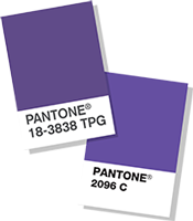
2018 Pantone Color of the Year!

2018 Ultra Violet Pantone_Harding Botanicals

"A dramatically provocative and thoughtful purple shade, PANTONE 18-3838 Ultra Violet communicates originality, ingenuity, and visionary thinking that points us toward the future.

Complex and contemplative, Ultra Violet suggests the mysteries of the cosmos, the intrigue of what lies ahead, and the discoveries beyond where we are now. The vast and limitless night sky is symbolic of what is possible and continues to inspire the desire to pursue a world beyond our own.

Enigmatic purples have also long been symbolic of counterculture, unconventionality, and artistic brilliance. Musical icons Prince, David Bowie, and Jimi Hendrix brought shades of Ultra Violet to the forefront of western pop culture as personal expressions of individuality. Nuanced and full of emotion, the depth of PANTONE 18-3838 Ultra Violet symbolizes experimentation and non-conformity, spurring individuals to imagine their unique mark on the world, and push boundaries through creative outlets.

Historically, there has been a mystical or spiritual quality attached to Ultra Violet. The color is often associated with mindfulness practices, which offer a higher ground to those seeking refuge from today’s over-stimulated world. The use of purple-toned lighting in meditation spaces and other gathering places energizes the communities that gather there and inspire connection." - Pantone

Source: https://www.pantone.com/color-of-the-year-...

Pantone Color of 2017: Greenery

The 2017 Pantone color of the year is... Greenery!!! And we couldn't be more excited about this year's choice. What are most passionate about is greenery!! Our purpose is to bring the beauty of outside nature into people's offices and homes. Our designs are aimed to provide a feeling of freshness and life. We all have a sense of calm when we are around plants, and plants bring so many benefits to our living spaces. Greenery reminds us that we can start new and fresh each day!

From Pantone: A refreshing and revitalizing shade, Greenery is symbolic of new beginnings.

Greenery is a fresh and zesty yellow-green shade that evokes the first days of spring when nature’s greens revive, restore and renew. Illustrative of flourishing foliage and the lushness of the great outdoors, the fortifying attributes of Greenery signals consumers to take a deep breath, oxygenate and reinvigorate.

Greenery is nature’s neutral. The more submerged people are in modern life, the greater their innate craving to immerse themselves in the physical beauty and inherent unity of the natural world. This shift is reflected by the proliferation of all things expressive of Greenery in daily lives through urban planning, architecture, lifestyle and design choices globally. A constant on the periphery, Greenery is now being pulled to the forefront - it is an omnipresent hue around the world.

A life-affirming shade, Greenery is also emblematic of the pursuit of personal passions and vitality.

Pantone 2017 Greenery